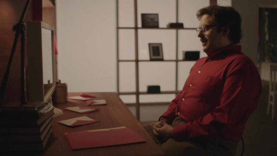
The story behind the SNL trailer-parody “Me” is a story about reacting when all of your best-laid plans go wrong. We had a great plan for shooting this spot but that plan completely fell apart…so here’s how we responded.
For starters, this spot is a satire of Spike Jonze’s “Her”, which is one of my favorite films of 2013, both thematically and aesthetically. I love the near-future look and use of an intimate warm palette as opposed to the usual steely blue (or, god help us: teal & orange) that has become the defacto look of science fiction. Hoyte Van Hoytema’s gorgeous cinematography was a perfect marriage with the design and tone – it’s a shame he wasn’t recognized with an Oscar nomination (but don’t get me started…no disrespect to any of the beautifully shot nominated films but IMO, Hoyte along with Sean Bobbit/12 Years a Slave are noticeably absent.)
Point is, what a treat to get a chance to recreate the look of “Her” with someone as funny as host Jonah Hill in the lead. The spot was written by Jonah along with Rob Klein, John Solomon and Kent Sublette, who together created a script that lovingly pokes a little fun at the movie’s premise of a man who falls in love with his Operating System. In this case, rather than Joaquin Phoenix’s “Theodore Twombly” character falling for his sexy Scarlett Johansson-voiced OS, Jonah Hill’s “Twombly” falls in love with an OS voiced by…himself.
The script draws on exact scenes from the movie so we already had an excellent reference to go after. Much of the movie takes place in Twombly’s LA high-rise apartment so, naturally, the apartment’s living room, bedroom and distinctive elevator were our main locations. Director Rhys Thomas is always careful to add as much scale to our spots as possible so he was also focused on somehow including the cabin scene. New York was still on the heels of the polar vortex and still had snow on the ground, so we were tempted to drag Jonah out to a park to shoot sun-flared shots from the movie’s mountain-retreat scenes but we quickly realized there was no way we’d have time for it. Little did we know how short our schedule would eventually become…
As I’ve often noted, a big part of my job at SNL is to be a cinematography-detective – to do whatever research I can into how the reference was originally shot and deduce the rest based on my own experience. Thankfully, there’s no shortage of articles about how “Her” was made. In particular, I found the ICG magazine interview with Van Hoytema to be the most technically revealing. In the article, he outlined exactly how they approached the movie, choosing to shoot on the Alexa for its low-light sensitivity so they could capture those gorgeous Los Angeles and Shanghai night skylines in near available-light. They also used a mixed bag of older lenses with stripped coatings to achieve the distinctive soft, hazy/flared look.
Our first challenge was to decide how to approach the incredibly specific architectural style of the apartment interiors. For about a split second we considered shooting on location – mostly due to finding an apartment (via @nycscout) that looked amazingly similar. But the weather was promising to be overcast and possibly snowing, so we quickly decided there was no way we could achieve a sunny Los Angeles look without building a set.
Art Director Andrea Purcigliotti designed our set with Rhys on Wednesday night, but bear in mind: we don’t have the luxury of just saying, “Build an entire replica set!” Our set construction crew also has to build the entire live show, too – so we have to be incredibly efficient in our set designs. One of the biggest challenges for Andrea and Rhys in designing a set is honing in on the key signifiers in the architecture and building only as much we need to sell the spot. On that note, just like “Midnight Coterie” and so many other parodies — this spot would be nothing without the incredible art direction. Young cinematographers take note: stop hogging the whole budget with your precious lights and camera gear! Give the budget to the art department and I guarantee they will make your job much easier than all those fancy toys. I was given a lot of very nice compliments about the look of our Wes Anderson spot but the truth is, the art direction was so perfect that all it took was a simple bounce light and we were lit.
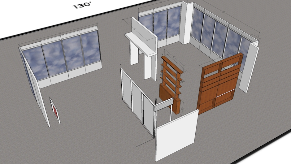
Andrea Purcigliotti’s set design, created in Sketchup Pro
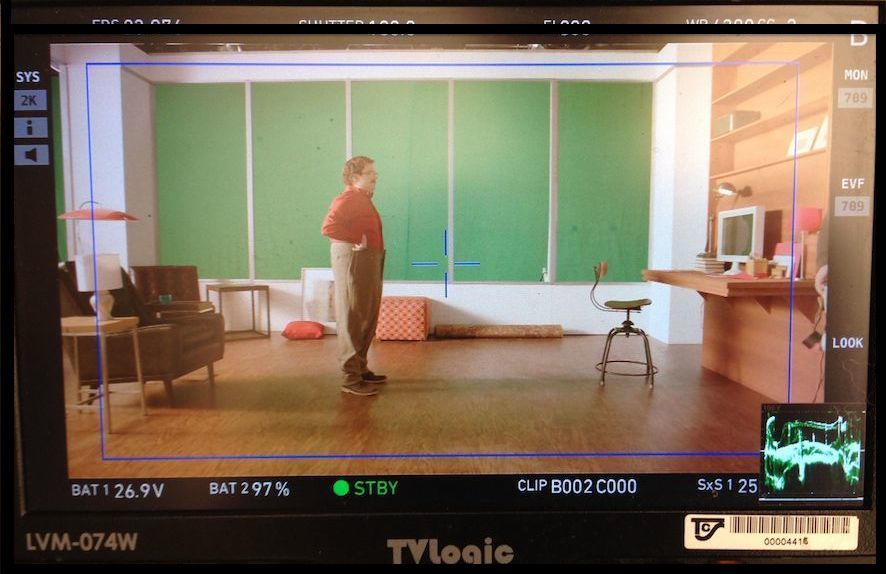
The biggest challenge of this set build was how to deal with the signature floor-to-ceiling windows throughout the apartment. We needed a Los Angeles cityscape outside those windows, with both a sunny daytime look and a vibrant night look. Our choices were either: greenscreen or translight. Both presented immediate problems: if we go with greenscreen, that would mean that nearly ever shot in the spot would require compositing. We were shooting this spot on a Friday and it had to broadcast the next day, so to add 25 or 30 VFX shots on top of the already absurdly short turn-around schedule seemed like a recipe for disaster.
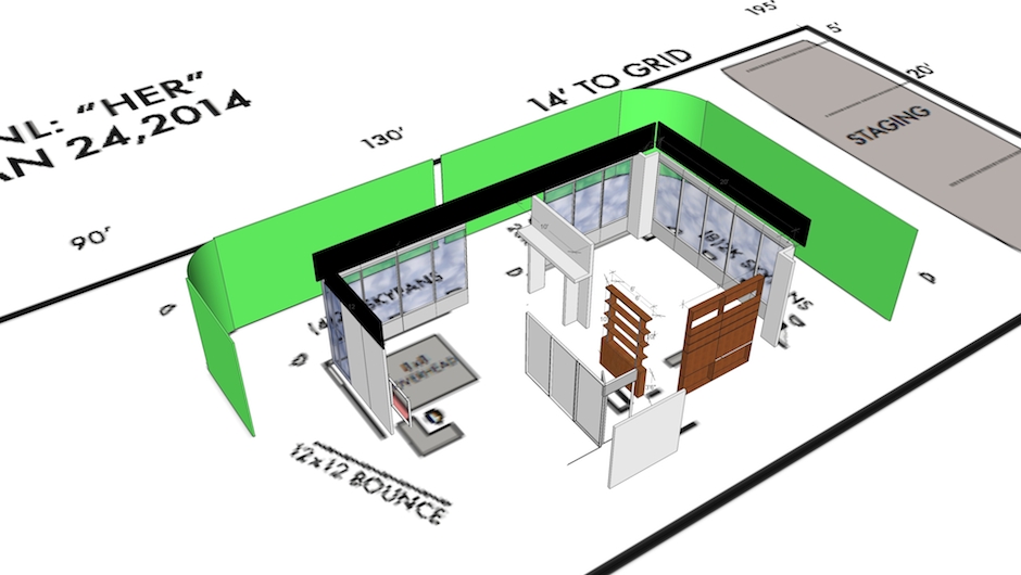
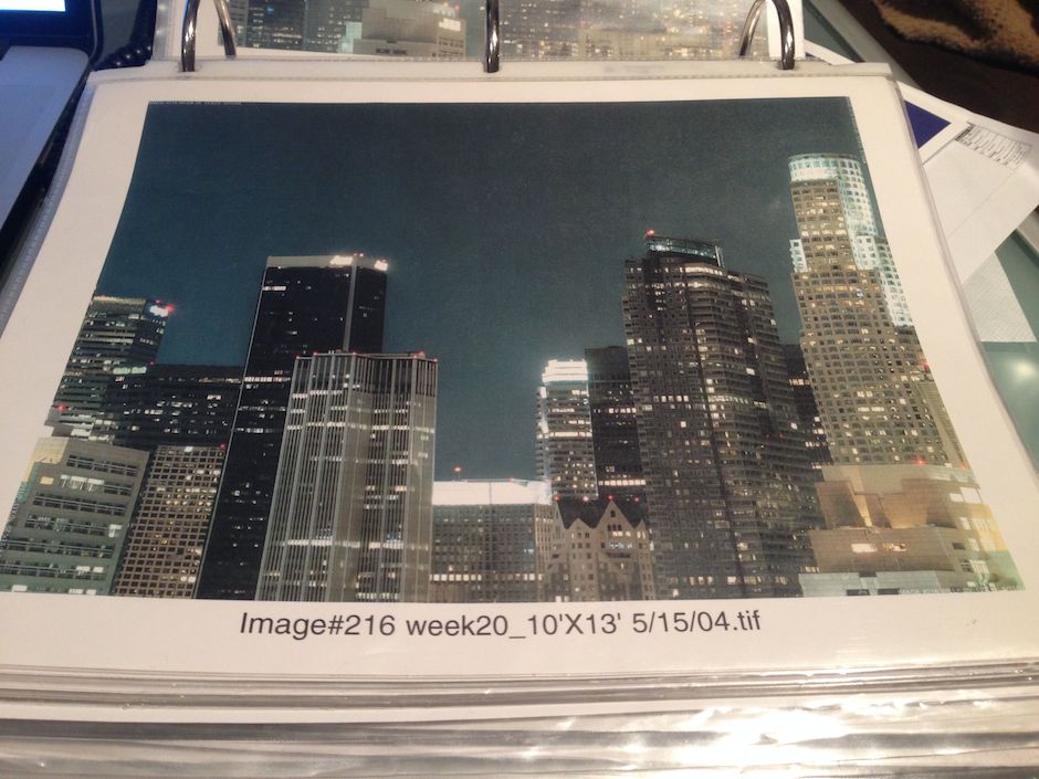
The alternative to greenscreen is a translight, which is a giant photographic backdrop that is hung outside the window of a set and, when lit properly, looks exactly like being on location. You can even get a Day/Night translight which, when front-lit looks like a daytime cityscape but when back-lit looks like a twinkly night skyline. The trick is that these translights have to be hung a distance away from the window so that they don’t look too sharp. Lighting them evenly requires distance too – perhaps 15’ to 20’ from the window. That means that the translights have to be much larger than the set window itself. For a set with floor-to-ceiling windows on two walls, you’re talking about a fairly large translight that wraps around the set. In our case, we were looking for a translight that was around 70’ long by 20’ high. Once hung, I could pre-light the translight from the front and the back, allowing us to toggle between a day-look and a night-look at the flip of a switch – with no compositing! This was a no-brainer…except for one completely inexplicable reality:
THERE ARE ALMOST NO TRANSLIGHTS IN NEW YORK.
If someone can explain this to me — please do – because I have been struggling to understand the dirth of translight options in New York for years. With all of the production and stage space available in the city, how can there be almost no options for large-scale city skylines? Don’t get me wrong, there are a couple of high quality vendors for smaller translights and painted backdrops; We use Oliphont Studio backdrops all the time. But no one carries anything of the scale that you’d need to shoot even an average-size set. The solution that I’m constantly offered: “You gotta get that from LA.” In the words of our buddy Seth Meyers: Really?!
So on Thursday morning our production manager, Justus McLarty, got on the horn with JC Backings in LA and found dozens of great options in ideal sizes: 75’x20’, 90’x20’…Obviously, getting the translight from LA to New York overnight is a hassle but it didn’t seem undoable…
EXCEPT THEY CAN’T OVERNIGHT ANYTHING LONGER THAN 15’.
So that means we have to pick translight options that are already much smaller than we’d prefer. We ended up finding a couple of decent options that are 64’x12’ and 40’x15’ — which are definitely not ideal but I thought could work. So we pull the trigger on the translights and are told that in a best case scenario, they’d arrive on set by around noon on Friday. Ugh. That means there is no way we could schedule a morning shoot, so we flipped our entire schedule and planned for a Friday night shoot instead. No one likes to pull an all-nighter, wrap at 7am and then have to finish the spot that same day but once in a while we have no choice. It was either that or shoot Friday morning with greenscreens and then have to deal with dozens of composite shots – which we decided would be even worse.
Next I had to figure out how I was going to light these massive translights for both day and night looks. There are many ways to skin that cat but I find the easiest and most common is to use a bunch of skypans — a very broad light with a bare bulb source that throws an even flat light. They come with either a 2k or 5k globe. In the film days we used to use 5k skypans but now with all of the hyper-sensitive new image sensors, I don’t need as much light so I tend to go with 2k skypans. My plan was to flat-light the translights from the front with a skypan every 6 feet or so. We’d hang skypans from a grid over the set to front-light for the day look and position another set of skypans on stands behind the translight to backlight for the night look. It will take a lot of skypans but luckily they are relatively inexpensive.
To sell the illusion of daylight on a translight-set, I’ll often also add a strong sun-source such as a 20k with ¼ CTS gel for a sunny look, or perhaps a large overhead bounce from outside the windows with ¼ CTB to create a flatter overcast look. Sometimes I’ll even add 1/8 Plus Green to simulate the look of the greenish glass used in high-rise office buildings. You can check out this post about an earlier spot, “Bathroom Businessman” for a description of that type of setup.
In this case, I was trying to simulate an exact shot from “Her”, which looked like earlier morning light semi-diffused through downtown LA haze, so I used a 20k with ½ CTS through an 8×8 frame of Half Soft Frost. For the night look, I was fascinated to learn about how Van Hoytema shot the original night exteriors. I read that they used almost no additional lighting outside of the practical lamps on set. They just used small custom-built LED instruments which they could easily color match to the outside color temperature and also dim way down without warming up the color temp. Great idea! I was very tempted to try the same technique but in the end I decided that dealing with the translights was going to be a big enough challenge; I didn’t need to add an experimental custom lighting rig into the mix. In retrospect, I’ve used LED strip-lights on theatrical-lighting jobs and they would have worked very well on this spot…Next time.
Simultaneously we had to sort out our camera package, but we kept it simple and ordered the same gear that they used on “Her”: a two-camera Alexa package with a set of Cooke Mini-S4s with stripped coatings for that signature soft contrast look – which our camera house, TCS, happened to have available – along with a set of Zeiss Super Speeds. The Zeiss lenses used on “Her” were also coating-less but I didn’t have time to track down a matching set.
By the end of a very long prep day on Thursday, we had a solid plan for the shoot and I went to bed feeling pretty good about it all…Then it all fell apart.
Friday morning began with a phone call from the shipping company that was delivering the translights:
THE TRANSLIGHTS WERE STILL ON THE GROUND IN LOS ANGELES.
Here’s a valuable little nugget we learned that day about shipping unusually long objects overnight: the only place that a 15’ long shipping tube can fit on an airplane is the nose-cone, and if there is already cargo in the nose-cone, the package has to wait for the next available flight. Apparently our translights sat at LAX all day waiting for a flight with nose-cone space and it just never happened. And the shipping company didn’t think to inform us.
So now it’s Friday at about 11am; we have to start lighting in a few hours and we have no translights to light. Our only choice is to go back to the greenscreen idea…except that since we pushed our schedule to a night shoot to accommodate the translight shipping, the greenscreen compositing schedule is now practically impossible. Oh crap.
We order the greenscreens and also make a last-second hunt through the catalogue of backdrops that the SNL Live Show has in their stock. The Live Show has a lot of backdrops but they’re relatively small – many no more than 10’ long – but I figured that if we line up a few of the backings on the same pipe and throw them out of focus, maybe you won’t notice that you’re looking at a combination of Los Angeles, New York and Philadelphia skylines! Justus also made a last second search through existing stock at Broderson in New York and found a good looking option, granted it was very small – 15’ long instead of the 70’ we were planning for. In the end, our new plan is to get away with these small backdrops whenever possible and only use greenscreen for the wider shots. If we could reduce the number of composite shots to only a handful, maybe we could actually pull this off despite having just a single-day for post production.
Another set I haven’t mentioned is the elevator set. If you’ve seen “Her” you’ll remember the distinctive shadowbox pattern of moving tree silhouettes that create the illusion of a moving elevator. Rhys and our graphics person created a simple animation in the vein of the moving trees, which we projected onto an 8×8 rear projection screen that made up the back wall of the elevator. Then I just rigged a couple of Image80 Kino Flos over the elevator as a soft toplight source.
Finally, the cabin set was actually just a faux-wood wall with another wall made out of a curtain on a rod. The lighting was mostly from the practical lamp sources on set, augmented only by a 2k open face bounced off an 8×8 unbleached muslin, dialed way down to match the warmth of the practical lamps. Ironically, the set we spent the least amount of time thinking about turned out to be – in my opinion – the best match to the real film.

So let’s talk about the night shoot itself. By “night shoot”, I mean literally: the cast is not available on Friday evenings until their full day of rehearsals and fittings, which means we can’t even start shooting until about 11pm at the earliest. Shooting on a Friday night also means that we’re keeping the host and cast members up all night leading into a very long Saturday that caps off with them performing live on TV…not exactly ideal! In most cases, we try to wrap by around 2am for everyone’s sake – and in a best case scenario, rehearsals might even finish early and we’d get our cast on set by 10:30pm instead of 11…
EXCEPT THAT REHEARSALS RAN LATE…
…so we didn’t have a cast to shoot until about 12:30am. Can we shoot the entire spot between 12:30 and 2am? We’ll try! This spot turned into the fastest per-setup shoot we’ve ever done. No, we didn’t finish by 2am but we made our entire shotlist and wrapped by about 3:30am. The biggest treat was when Michael Cera dropped by at around 1am to play “the surrogate”. Somehow having the “Superbad” duo reunite on set with us kept the whole shoot light and fun, despite the late hour.
The biggest miracle, of course, is how in the world director Rhys Thomas, editor Adam Epstein and VFX Supervisor Todd Sparsfield finished this spot in the next 12 hours for broadcast that night. By using our stiched-together translights, we managed to reduce the number of greenscreen shots to just two(!). The night backdrops looked a little funky so Todd also added additional twinkly-light effects to the skylines to polish them up, along with some additional sun flares to the daytime scenes.
In the end, a spot lives or dies not by how good it looks but by how funny it is. Lucky for us, Jonah Hill and Michael Cera are such funny and talented guys (and let’s not overlook Vanessa Bayer’s spot-on Amy Adams impression). I was especially impressed with how committed Jonah was to staying true to the introspective tone of the original film – this wasn’t just broad jokes while dressed in high-waisted pants. Jonah shared with us that he actually called Spike Jonze beforehand to make sure he was okay with the spot (he was), and in the wake of the spot’s broadcast, it was so gratifying to see how many people who loved “Her” had fun with “Me”.
Spike and Hoyte, if you’re reading this: bravo on the inspiration. As for the rest of you: go watch “Her” – one of the best looking films of the year no matter what the Academy thinks!

